Monthly Archives: May 2014

First Half of May in Illinois – Warm, Wet, And Then Snow

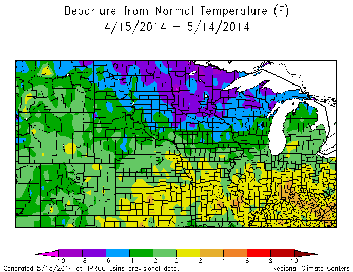
According to preliminary records, the first half of May was both warmer and wetter than average for many locations in Illinois. The statewide average temperature was 61.2 degrees, about 1.4 degrees above average. Meanwhile, this morning there are reports of snow falling in northern Illinois. Talk about weather extremes. This was after last weekend when we saw widespread reports of highs in the upper 80s and low 90s.

The statewide average precipitation was 2.43 inches, 18 percent above average. Here is a screenshot of the last 14 days showing the widespread and heavy rainfall in much of the northeast, east-central, and southern parts of Illinois with many sites reporting between 3 to 6 inches of rain. Parts of western and central Illinois have not been as wet with amounts in the range of 1 to 3 inches of rain.
14days


Snow in May? Read more on the Chicago NWS page. It looks like Rockford set a new record for the latest report of snowfall in the season. The Chicago record still stands at June 2, 1910.

snow

Map courtesy of the Chicago NWS office.

Forecast for June and Summer In Illinois – Cool and Wet

The Climate Prediction Center released their latest forecasts today (May 15) for June and this summer with cooler and wetter than average conditions expected in parts of Illinois.

The temperature forecast for June (Figure 1) in Illinois includes an area to the north of Interstate 74 with an increased chance of being cooler than average.  This is part of a larger area of cooler conditions that runs across the northern states from the Rockies to the Appalachians. The rest of Illinois is labeled EC for equal chances of above, below, and near-average conditions – a neutral forecast.

off14_temp

Figure 1. June Temperature. Click to enlarge.

The precipitation forecast for June (Figure 2) in Illinois includes an area south of Interstate 74 with an increased chance of above average precipitation. BTW, while I used Interstate 74 as the dividing line, the forecast obviously is not that precise in terms of geography.

off14_prcp

Figure 2. June Precipitation. Click to enlarge.

The temperature forecast for June-August (traditional summer) includes northern Illinois in an area with an increased chance of below-average temperatures along with states to the north. The rest of Illinois is labeled EC for equal chances (Figure 3).

off01_temp

Figure 3. Click to enlarge.

The precipitation forecast for June-August (traditional summer) has EC across Illinois and most of the Midwest (Figure 4).

off01_prcp

Figure 4. Click to enlarge.

If the temperature pattern for June and June-August seems familiar, here is what we have experienced in the last 30-days for Illinois and the Midwest (Figure 5). Notice the much-colder-than average temperatures across the upper Midwest (4 to 8 degrees below average). Also central Illinois has been the dividing line between the colder-than-average conditions to the north and the slightly warmer-than-average conditions to the south.

30dTDeptNWSCR

Figure 5. Click to enlarge.

New El Nino Alert

The NOAA Climate Prediction Center has released a new El Niño watch stating,

Chance of El Niño increases during the remainder of the year, exceeding 65% during summer.

At this point it is not clear how strong this El Niño will be. However, it has the potential to be very strong. The two major El Niño events in my career were the 1982-83 and 1997-98 event. Looking at the June-August period at the start of those two events, there was a widespread pattern of cooler than average (1981-2010) conditions across the Midwest. On the other hand, there was not a consistent pattern of precipitation. Average to above-average precipitation fell in Illinois in the summer of 1982 while average to below-average precipitation fell in 1997, depending on where you were. It was notably drier in western Illinois in the summer of 1997.

19821997summer

The temperature pattern shifted in September and October, with warmer than average conditions in the western Corn Belt. This was especially true in 1997. Illinois was split with the northwest being warmer and the southeast being colder than average for September/October. This fall was notably dry across the northern half of Illinois in 1982 and near-average in 1997.

19821997fall

Overall, the last two major El Niño events produced widespread cooler summer temperatures but were somewhat inconsistent in terms of fall temperatures as well as summer and fall precipitation. Of course, our sample size is small and as the stock brokers are supposed to say, “past performance does not guarantee future results”.

BTW, over at climate.gov there is a new blog about El Niño-Southern Oscillation (ENSO) that describes the situation on a regular basis. ENSO is the general term for El Niño (warm phase), La Niña (cold phase), and the neutral phase of conditions in the Pacific Ocean along the equator. In fact, they have an excellent short tutorial on the three phases here. Here is an excellent illustration of the La Niña and El Niño pattern in the Pacific Ocean from NOAA. One can clearly see the blue colder than average waters across the equator during La Niña (top panel) and the red warmer than average waters during El Niño (lower panel). iconic_ENSO_610

New U.S. National Climate Assessment Released

CS_Net_Change_in_annual_Precip_12909_v9

Observed Precipitation Changes in the US. The colors on the map show annual total precipitation changes for 1991-2012 compared to the 1901-1960 average, and show wetter conditions in most areas. The bars on the graphs show average precipitation differences by decade for 1901-2012 (relative to the 1901-1960 average) for each region. The far right bar in each graph is for 2001-2012. (Figure source: adapted from Peterson et al. 20131). Click to enlarge.

The third U.S. National Climate Assessment was released today, including state-specific fact sheets like this one for Illinois.  I’ll post some Illinois specific comments in the near future.

The assessments are mandated by law with the intent of providing the latest report of climate change and it’s impacts on the United States.

Here are the key findings for the Midwest (the Midwest report is located here):

  • In the next few decades, longer growing seasons and rising carbon dioxide levels will increase yields of some crops, though those benefits will be progressively offset by extreme weather events. Though adaptation options can reduce some of the detrimental effects, in the long term, the combined stresses associated with climate change are expected to decrease agricultural productivity.
  • The composition of the region’s forests is expected to change as rising temperatures drive habitats for many tree species northward. The role of the region’s forests as a net absorber of carbon is at risk from disruptions to forest ecosystems, in part due to climate change.
  • Increased heat wave intensity and frequency, increased humidity, degraded air quality, and reduced water quality will increase public health risks.
  • The Midwest has a highly energy-intensive economy with per capita emissions of greenhouse gases more than 20% higher than the national average. The region also has a large and increasingly utilized potential to reduce emissions that cause climate change.
  • Extreme rainfall events and flooding have increased during the last century, and these trends are expected to continue, causing erosion, declining water quality, and negative impacts on transportation, agriculture, human health, and infrastructure.
  • Climate change will exacerbate a range of risks to the Great Lakes, including changes in the range and distribution of certain fish species, increased invasive species and harmful blooms of algae, and declining beach health. Ice cover declines will lengthen the commercial navigation season [this winter was the exception to the rule – Jim].

Tornado Trends in Illinois – Updated

2014-03-21photo1The tornado trends in Illinois has been updated to include data through 2013. The plots in order are the number of tornado reports by year, deaths by year, and injuries per year. Click to enlarge each plot.

These plots are based on storm data at the National Climatic Data Center (NCDC). Tornado records are notorious for not being consistent over time. It is nobody’s fault – technology changes and reporting techniques have improved over time. The newer NWS Doppler radar systems were installed in the 1990s, the spotter networks continue to improve, and everyone has a cell phone with a camera.  As a result, the number of tornadoes has increased in recent years with the better accounting.

In addition, there is always the potential for over-counting the number of tornadoes as they travel. For example, you might have a report for a tornado spotted 2 miles west of Smithville, and then another report 10 minutes later of a tornado north of Smithville. Was this the same tornado or two separate ones? Hard to tell without supporting evidence, especially before the modern-day radars.

I think the number of deaths and injuries by year in Illinois may actually be more reliable than the tornado frequency because they were just as widely reported in the media in the 1950s and 1960s as they are today. One can clearly see the spike in 1967 due to the Oak Lawn/Belvidere tornado outbreak and the 1990 spike from the Plainfield tornado. Sadly, the last two years have been bad in terms of fatalities in Illinois – 2012 with 9 deaths (Harrisburg, IL) and 2013 with 8 deaths (November 17, 2013 outbreak) after 7 relatively quiet years.

If you want to look at US trends, check out the NCDC page on tornado trends.

tornado-year

fatal-year

injury-year